Apple expressed its ambition to elevate the iPad with specialized software. Final Cut Pro gives users more options, but there are still some limitations if you are used to using the version on MacOS.
After being added Final Cut Pro and Logic Pro on May 24, iPad has an additional set of professional-oriented work tools for users who need to edit movies and make music. This is a highlight for the iPad Pro product line, which Apple has invested in for a few years with a very high configuration M-series chip, but still lacks some professional applications.
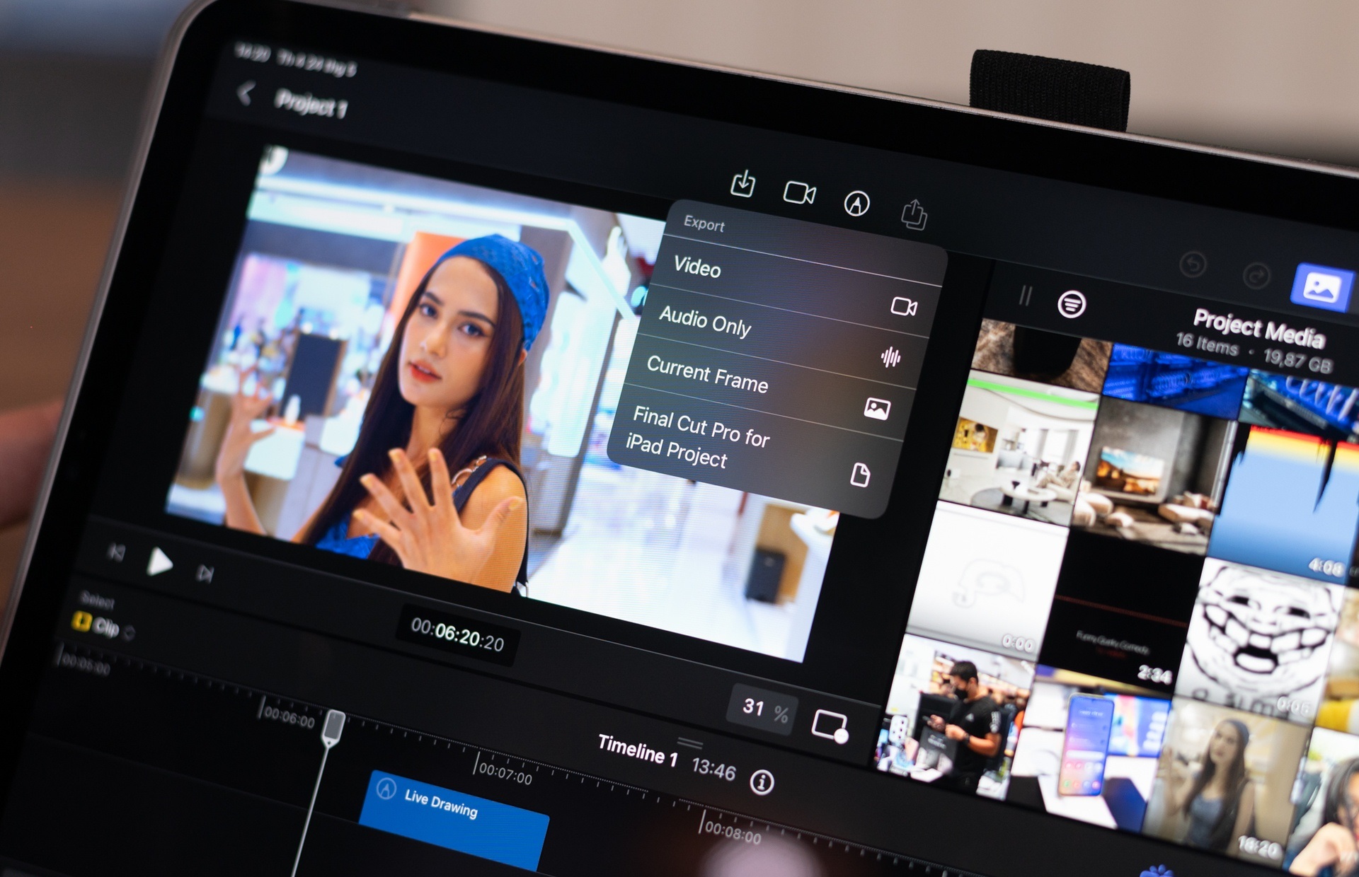
On Fincal Cut Pro, Apple creates many smart solutions so that customers can use their own fingers for adjustment and cutting. This makes the difference between a genuine app and Luma Fusion, Davinci Resolve or CapCut on iPad.
However, this is still an alternative application, reducing the features from the tool available on the PC. For temporary users or editing on the go and prioritizing compactness, Final Cut Pro on iPad can come into play.
Newbie-friendly
In the process of working with video editing applications, I think that what newbies need to get used to is the core of the application. Each app is created by the developer with its own logic. As a result, it is often difficult for editors to switch to another application once they are familiar with how the original tool works.
For those familiar with the interface and how to use Final Cut Pro on Mac, the app on the iPad is almost identical. A friend of mine, who regularly edits movies with Final Cut Pro on his MacBook, only takes about 15 minutes to learn to use the tool on the iPad because the way the app works is not much different.
As someone who has used several editing apps and is now familiar with Premiere Pro, I find Adobe’s software features to be its versatile effects palette, cascading timeline, and keyframe. Davinci Resolve has Nodes to hook up the feature. Meanwhile, Final Cut Pro is exclusive to MacOS, showing everything available to the first-time user.
Although only used to using Premiere Pro, my process of getting used to Final Cut Pro on iPad didn’t take long, thanks in part to the small number of features and intuitive interface. Initial operations such as creating projects, setting settings, adding editing files are all very simple to use.
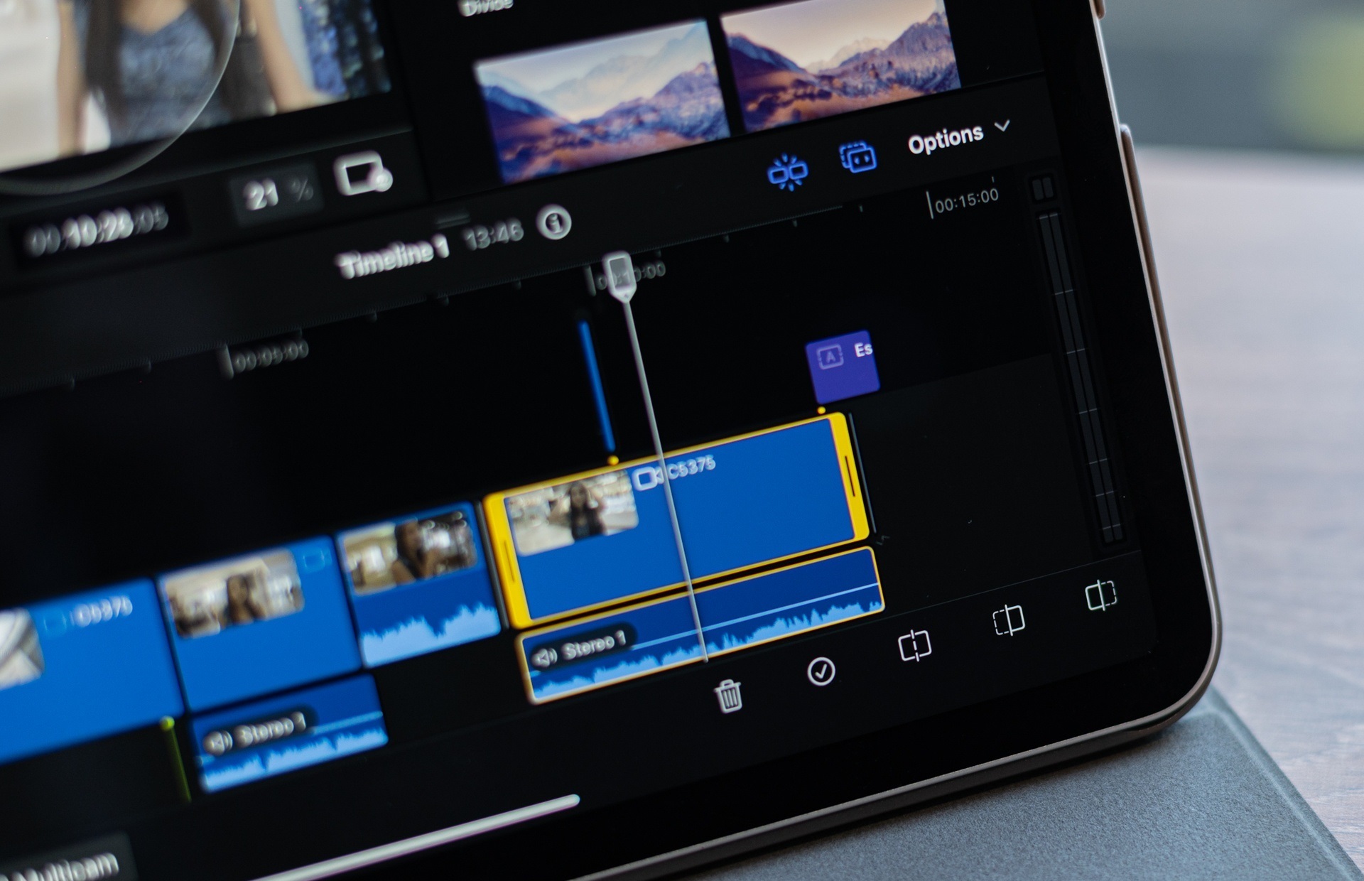
Inside with the Timeline, the Preview box, the effects or customizations are all very familiar. Some difficulties will appear when I need to use other operations, such as cutting, trimming, editing movies.
Overall, Final Cut Pro for iPad is designed strictly according to Apple’s philosophy, very simple. Although users are familiar with the interface and working of Premiere Pro, Davinci Resolve or CapCut before, getting used to Apple’s new app does not take much time.
Meanwhile, for a complete newbie, who has never edited a movie before, Apple shares a sample project to see what the software can do. Apple’s support tool also has dozens of video tutorials for users to grasp the feature. But I think direct practice is the best way to self-study. Watching video tutorials is time consuming and relatively boring.
Limit on touch screen
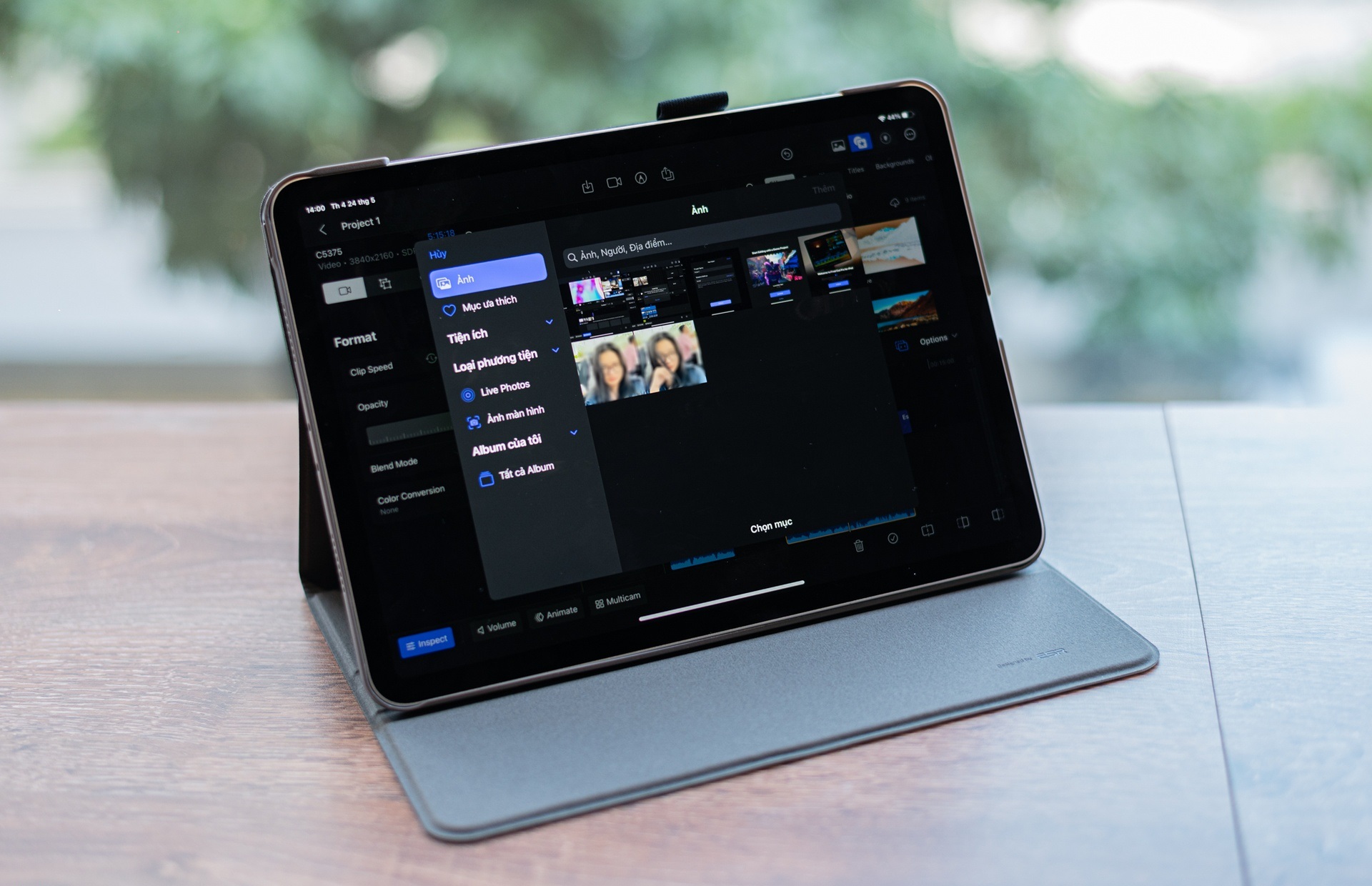
This is a tablet-based application, screen size 10-13 inches, interacting mainly by touch operations on fingers. Therefore, the biggest difficulty of the developer is to optimize this control.
An editing app often needs a lot of functional items to appear together for users to manipulate. The essential parts usually include Timeline, Preview, Source, File, Effects, Sound… Each application has its own arrangement and layout so that all parts fit on the screen frame. However, I think that exposing it all for quick action is the most optimal method for the experience. Therefore, many filmmakers choose to use 2 to 3 Screens to support their work.
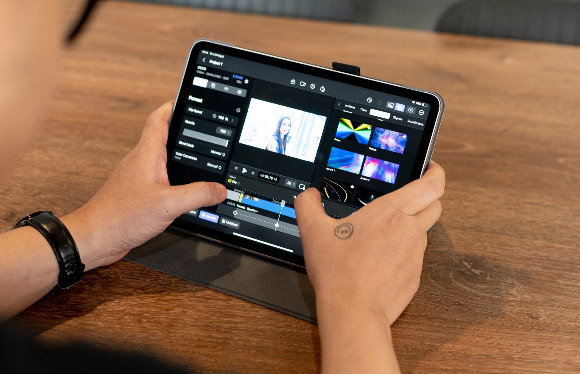
With the same requirements as above, but the tablet montage app is limited to a much smaller frame, requiring developers to optimize. Finger manipulation is not the same as a mouse. This type of control is easy to error because the reception area is large and the finger also covers a part of the screen area.
Final Cut Pro partially solves this problem by breaking down tools into parts and allowing the size of some parts to be customized. For example, the File, Preview section can be minimized to increase space when the Timeline has many layers.
During the process of getting used to the 11-inch iPad Pro, I felt quite uncomfortable when the components on the screen were too large, limiting the usable space. In addition, it takes me more time to perform a task than it does on the computer. However, this may be the best solution for users who can manipulate touch on an editing tool.
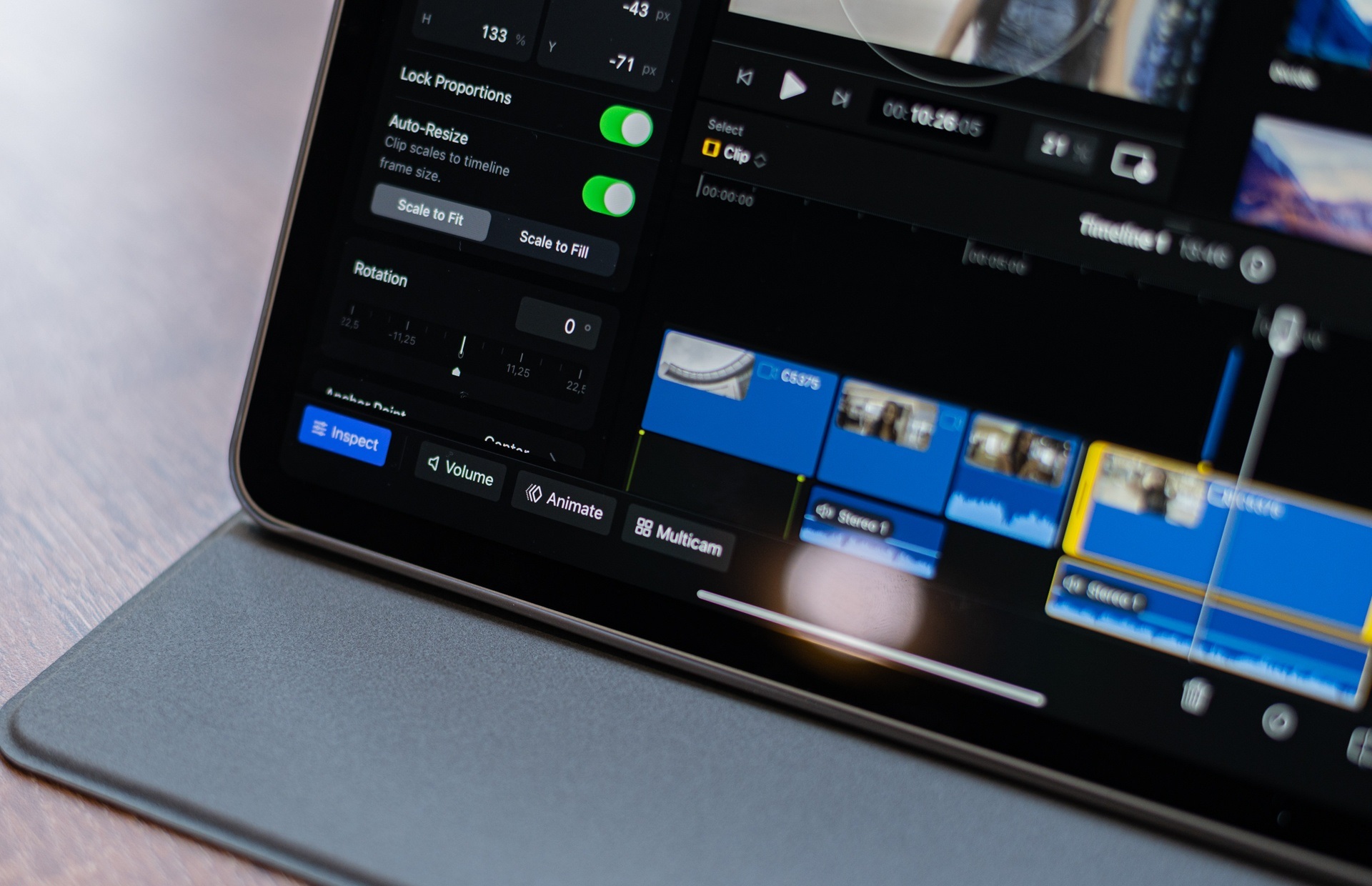
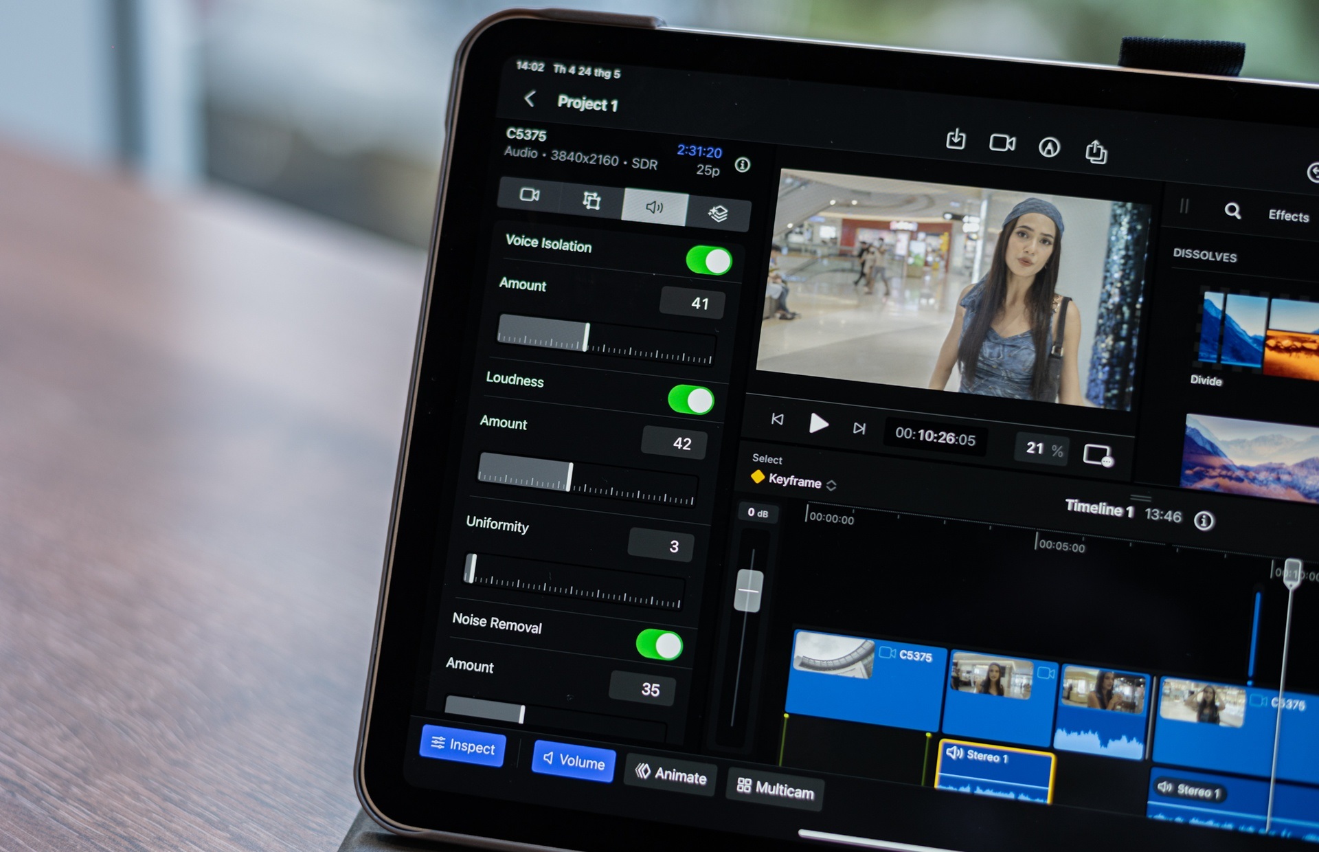
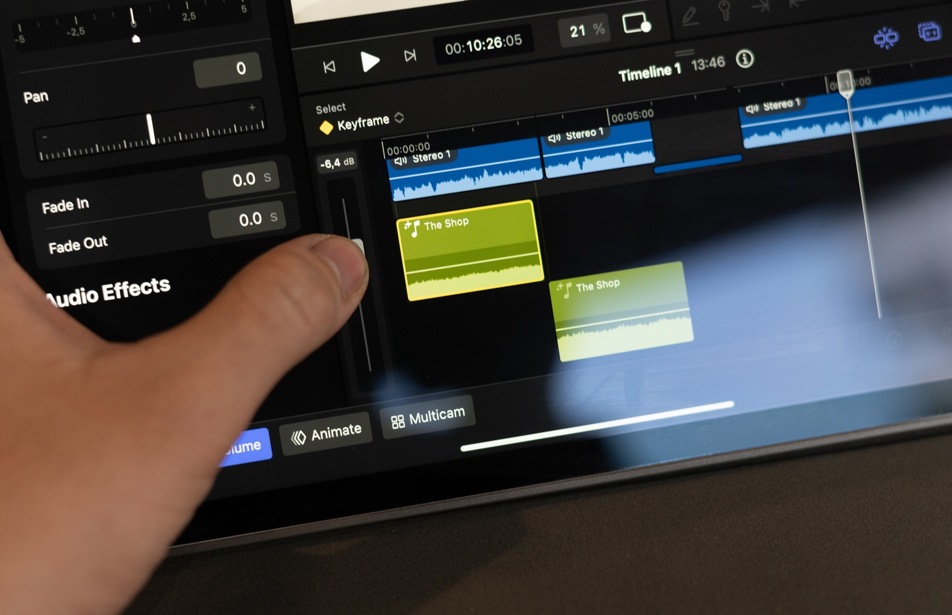
In addition to the fixed parts including Source, Preview and Timeline, Apple expands the customizations including Inspect, Expand, Volume, Animate, Multicam. These details, or even the Layer width, are also allowed by Apple to customize so that users have enough space to manipulate the iPad screen.
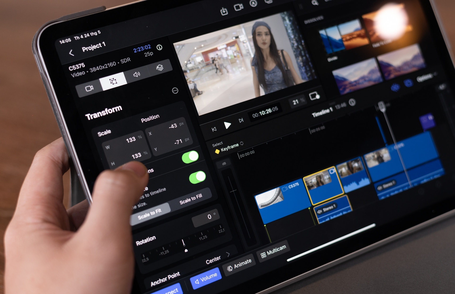
In particular, the Inspect section has a similar operation to the Control section of Premiere Pro. Users can fine-tune in detail all parameters of effects, frames, quality, color, and time of components added in the video.
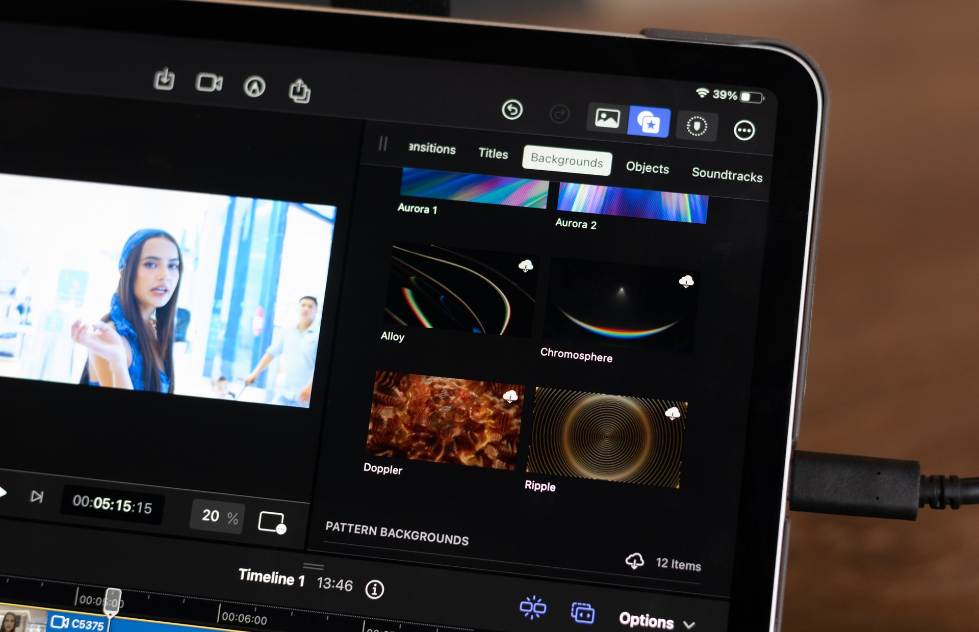
The extension includes effects, transitions, banners, backgrounds, shapes, and sounds. These are the basic components to add to the project. Apple is quite generous to provide quite a few models available in this section, with good quality, for non-specialists to use right away.
Freeing fingertips
Editing work requires precise manipulation and high meticulousness. However, fingertips are not a good means of doing this. Apple creates many solutions so that users don’t have to struggle when using Final Cut Pro with touch on iPad.
For example, Apple creates a virtual knob on the screen. The way it works is similar to the physical workbench that BlackMagic sells, using the same Davinci Resolve. Users do not need to align each frame of the video when this rotation will do it.
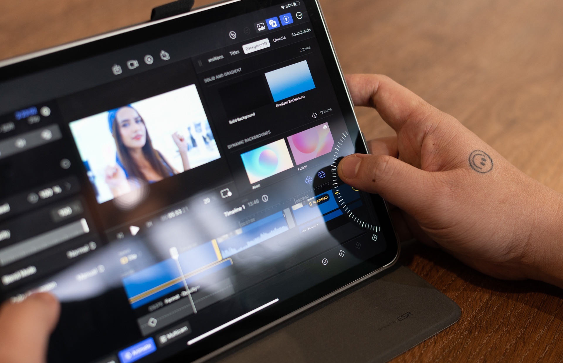
On the other hand, the familiar drag and drop operation on the computer is also not optimal for the iPad, because the finger covers a lot of content. The company prioritizes users to use the option to push the selected file to the Timeline with the click of a button. This way when combined with the rotation will ensure the accuracy of the operation. But to me, dragging and dropping files is still more familiar.
In addition, the deep customization of the effect is also converted by Apple into a bar drag, stepwise. This method is rarely used on computers because it is inaccurate and slower. However, it is very suitable for the touch screen of the iPad. During the editing process, zooming, choosing a position on the Timeline with your finger is also very intuitive.
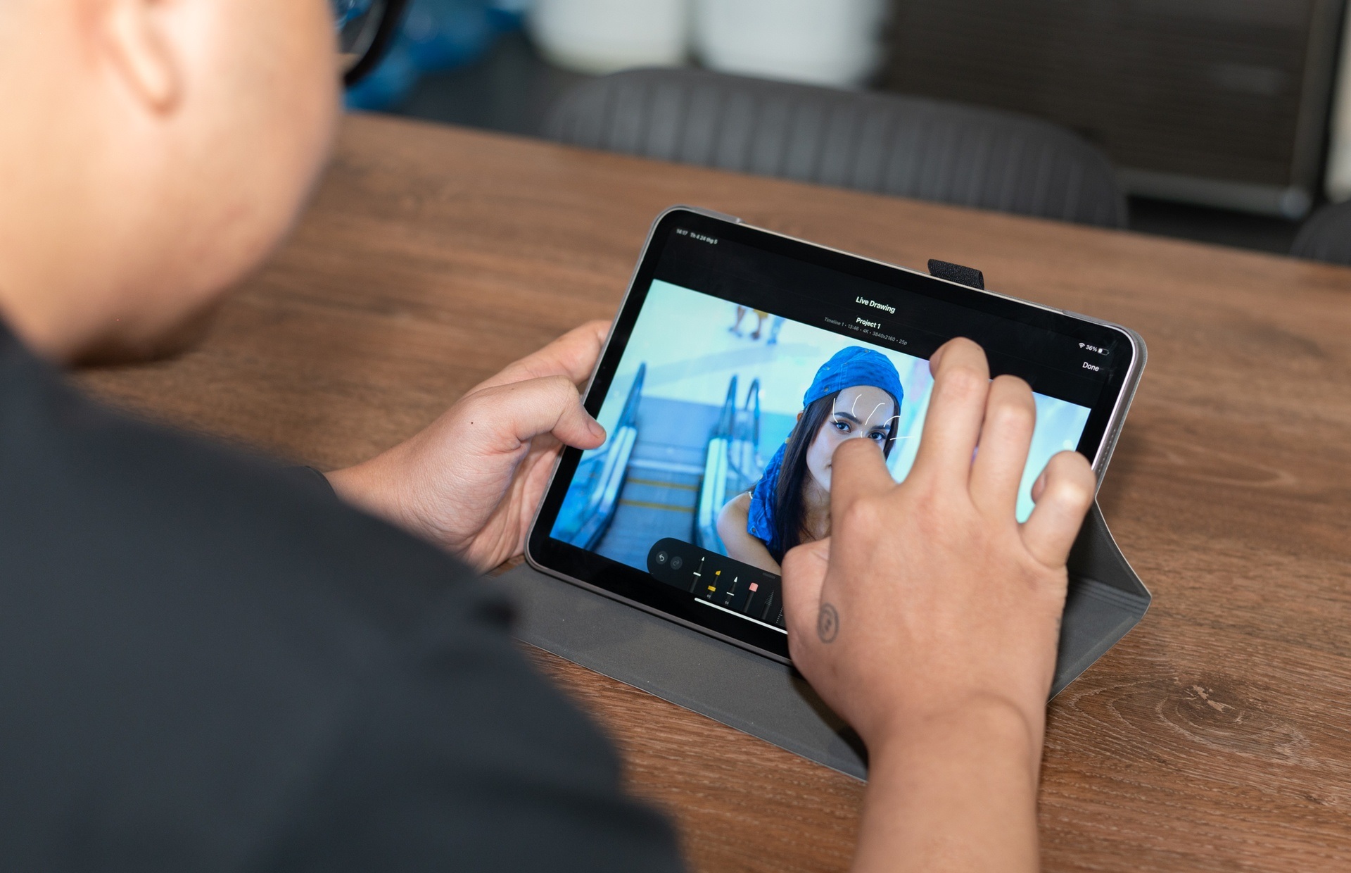
Some interesting features that Apple makes specifically for iPad users are subject-based frame recognition, drawing illustrations directly on video. Specifically, users can easily convert horizontal videos to vertical, with the main subject always in the middle. The software will recognize to select the appropriate frame instead of having to keyframe it manually.
This function is essential in the period when vertical content is on the rise and video creators share on multiple platforms. I can also use Apple Pencil to draw illustrations directly on the video. Final Cut Pro converts this action to a live graphic.
Not quite “Pro”
Apple adds the suffix “Pro” to the names of products aimed at professional users, including software. However, Final Cut Pro on iPad still stops at the level for semi-professionals, serving the needs of fast editing, instead of high quality.
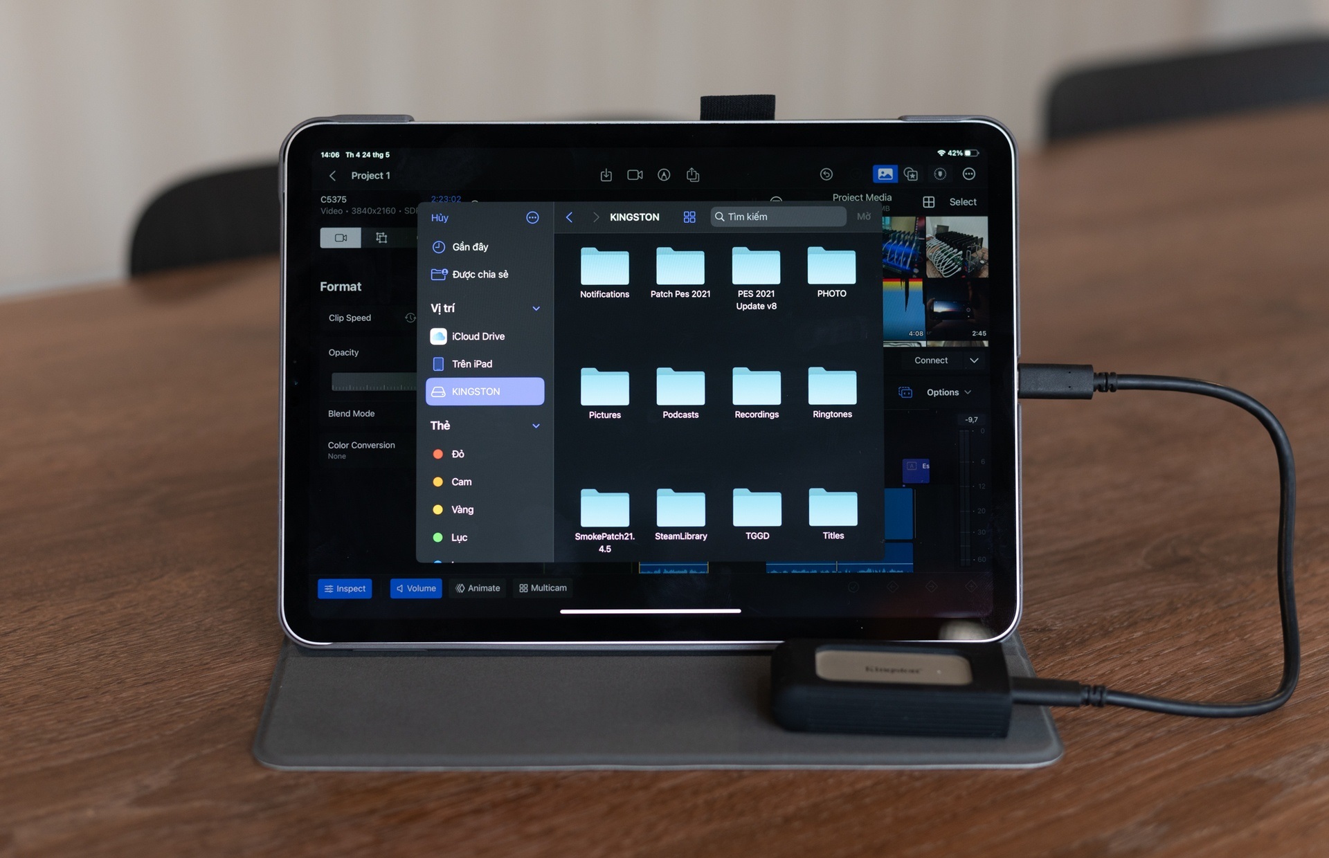
The tool Apple created still lacks many important parts, which need to be expanded in the future. For example, Final Cut Pro’s file manager still doesn’t have a folder option, which makes it difficult to work with large files of projects.
Expansion items, effects can be appreciated with quality, but quantity is not enough. I was forced to deal with a limited supply from Apple. Typically, users can add these resources, from 3rd party sources, to use for their own needs. However, this function is not yet available on the iPad version of Final Cut Pro.
On the other hand, an important part of the modern filmmaker’s color correction is still very sketchy on the app. I can’t add LUTs (color swatches) or depth settings to the color of the video. The subject separation feature to insert more graphics behind is still not effective. CapCut is a tool that does this better on mobile.
Also, when testing with a 4K, 10-bit footage shot with a Sony camera, Final Cut Pro took a long time to render. At the same time, the device also heats up quickly, draining the battery. Therefore, it is difficult for me to trust to put my trust in important projects.
In turn, this is an easy-to-use tool, which is great for people who are using editing apps like CapCut or Final Cut Pro on their MacBook. The video genre suitable for this software is reportage, vlog, podcast or short video. Apple also clearly expressed its desire for more people to access and use the app when selling the application as a subscription, instead of the high price like on the MacBook.
Despite some limitations when targeting professional users, Final Cut Pro is still a good editing app for general users and use iPad.
